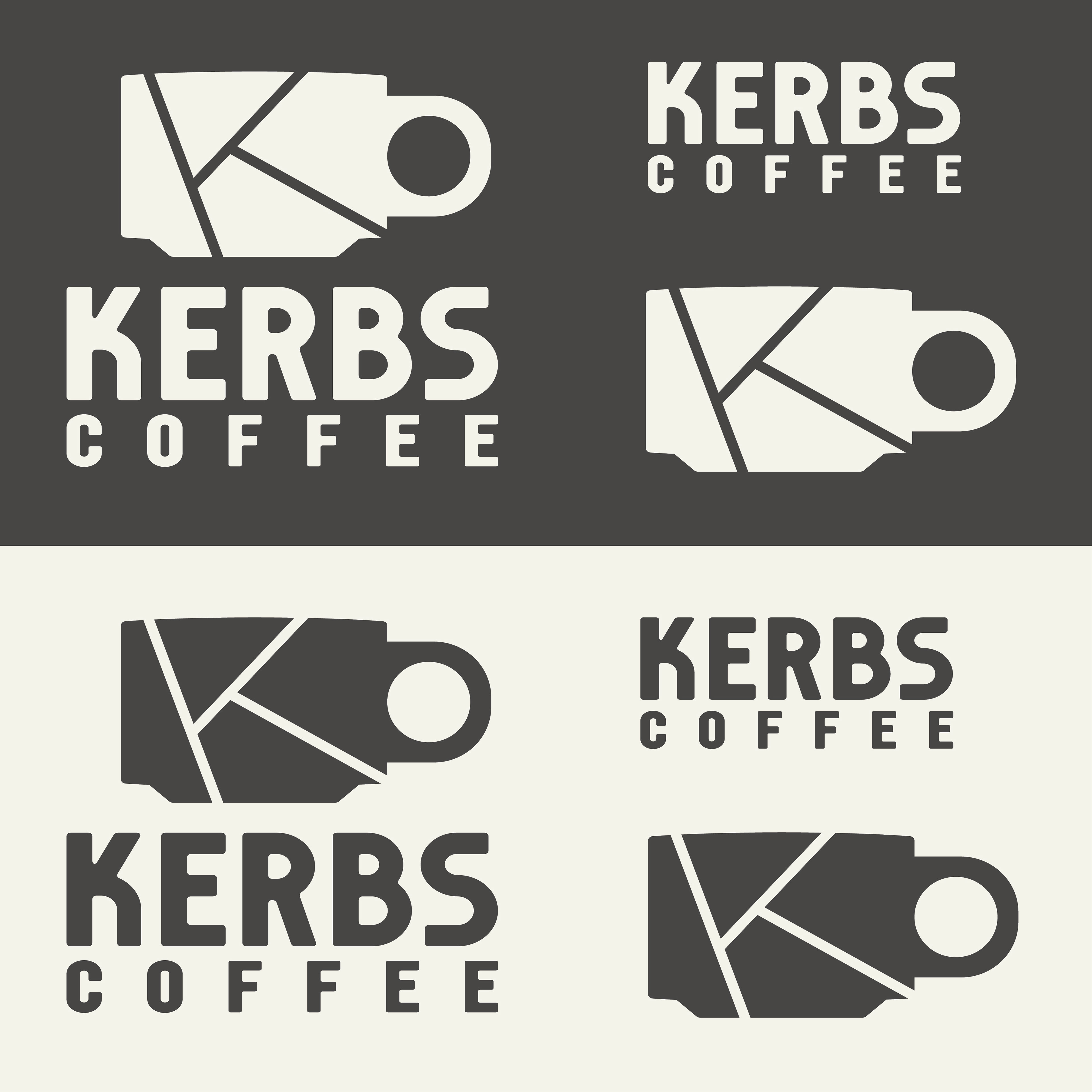
SUMMARY: Simple branding for Kerbs Coffee
OBJECTIVE: Create a professional visual identity for a mobile coffee cart that pays homage to their original logo but provides a cleaner aesthetic and leaves room to change the name while retaining the chosen icon, using a minimalist aesthetic.
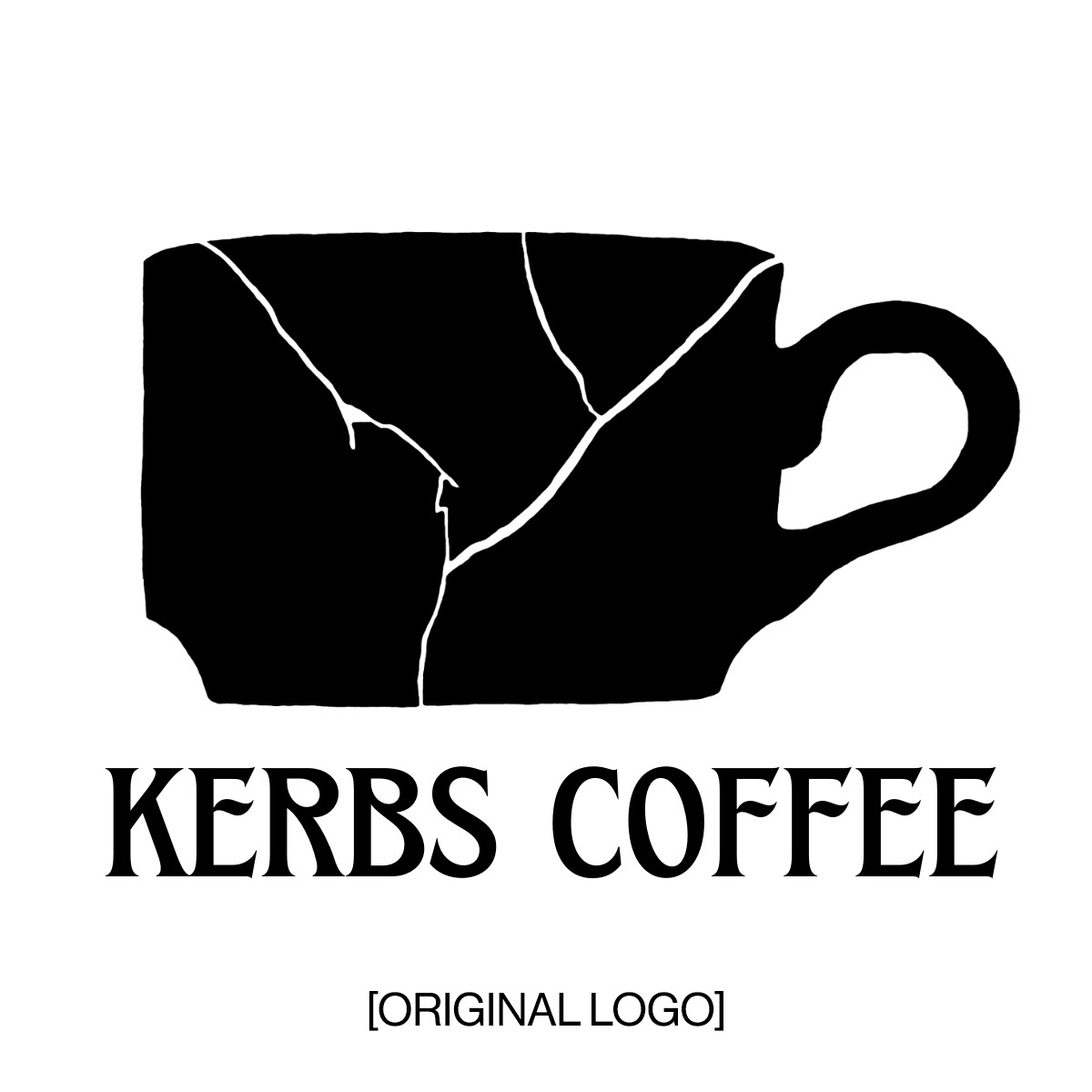
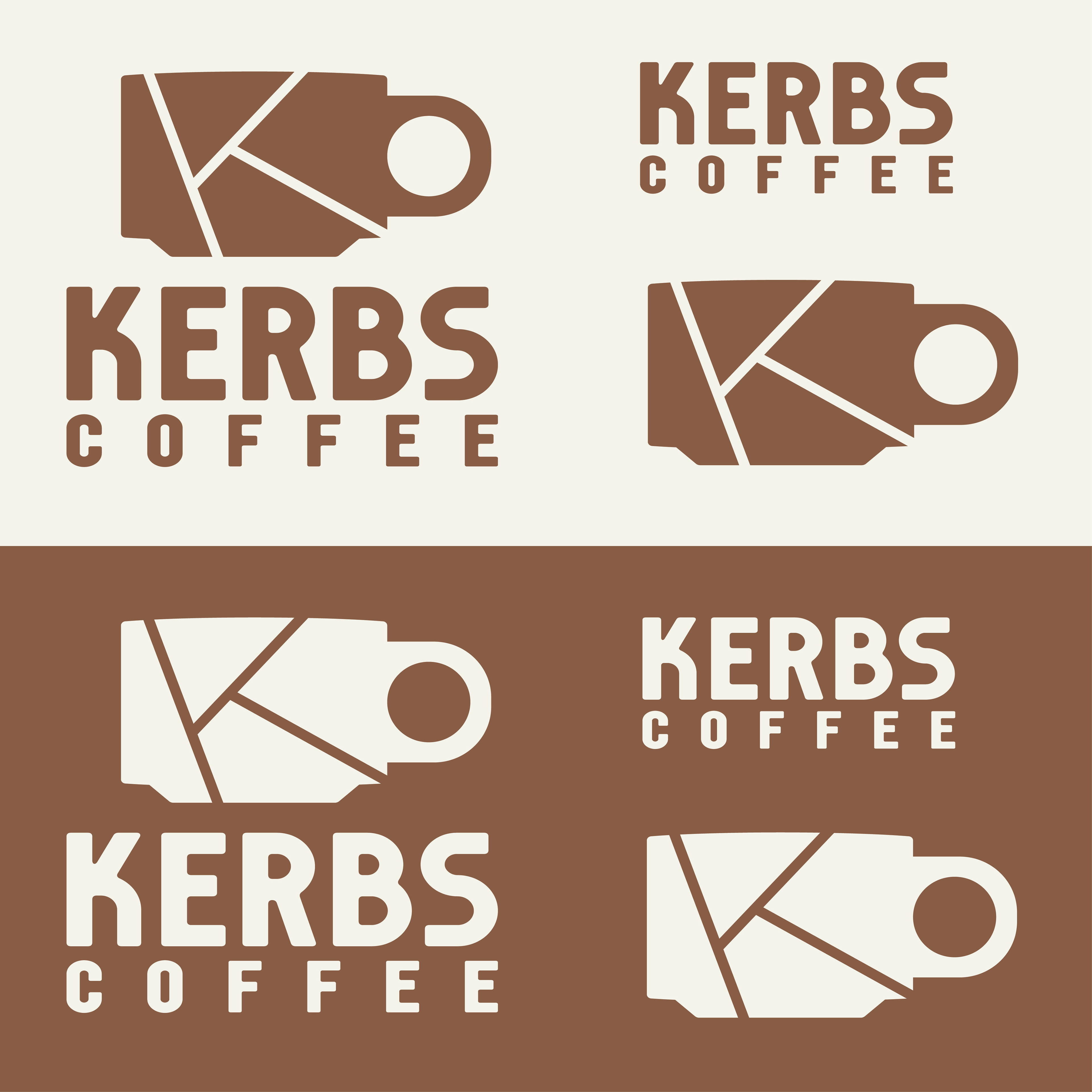
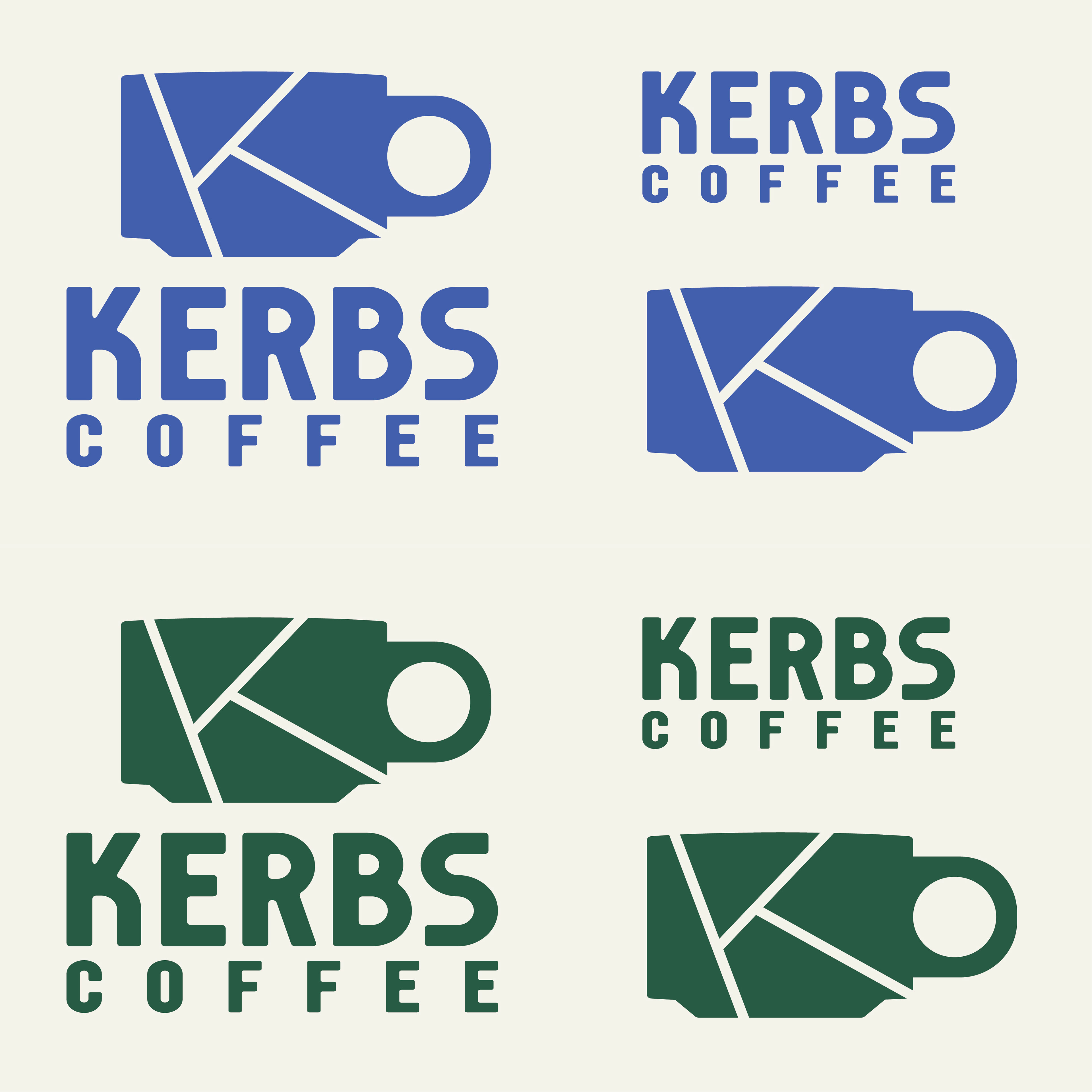
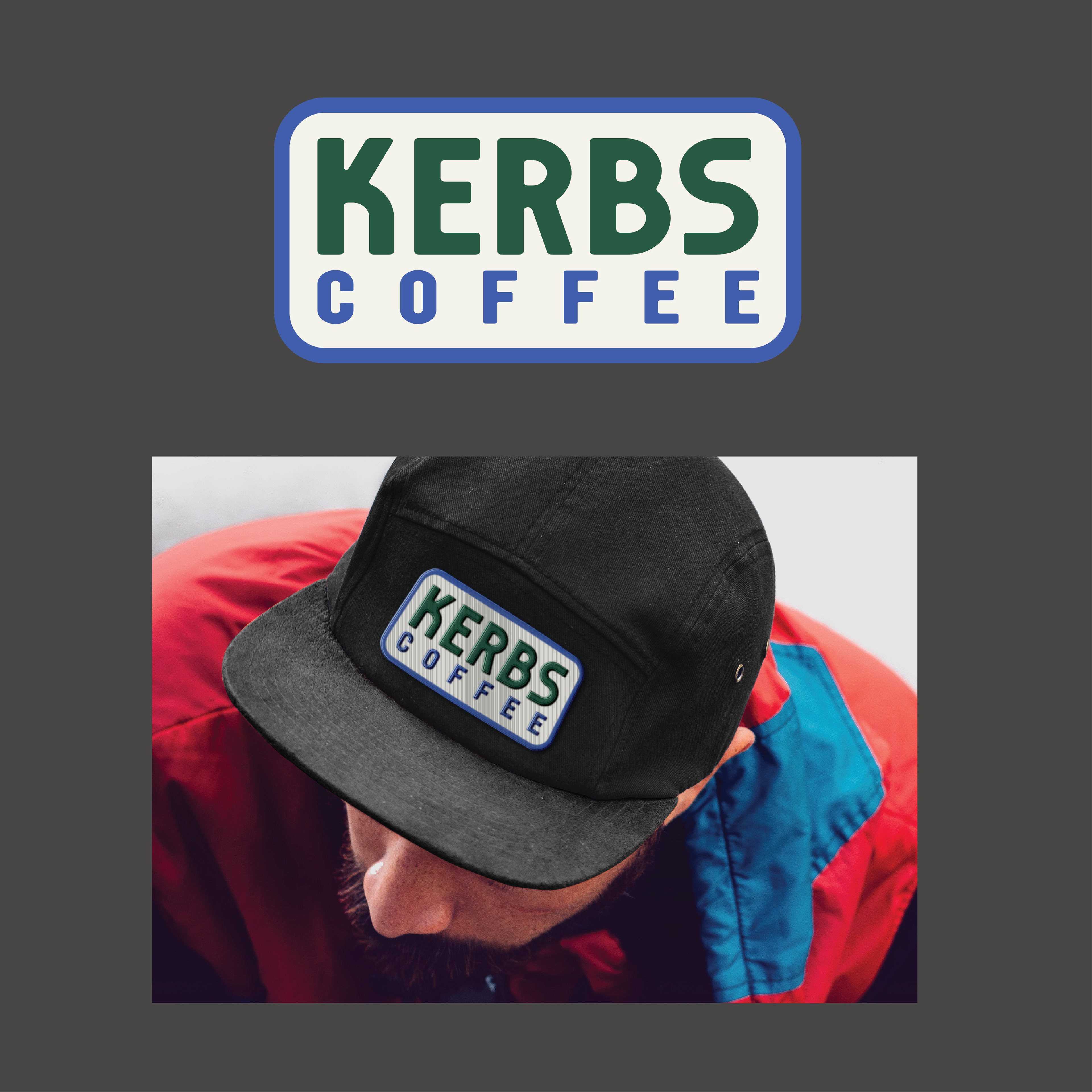
SOLUTION: Refined KC’s original cracked cup icon to a cleaner, simpler design, making the cracks form a “K” to immortalize the original name in the event of a name change without requiring a complete rebrand. Provided a wordmark and full logo with licensed typeface and created brand color palette. Created new menus using the updated brand.
OUTCOME: This branding has been implemented by Kerb’s Coffee and is currently in use.
TOOLS: Adobe Illustrator